Prioritize the working context
Group information around the task rather than treating every detail as equally prominent.
 Vidhisha Kedia
TEKION · ENTERPRISE SAAS
My work as a Senior Product Designer in automotive software.
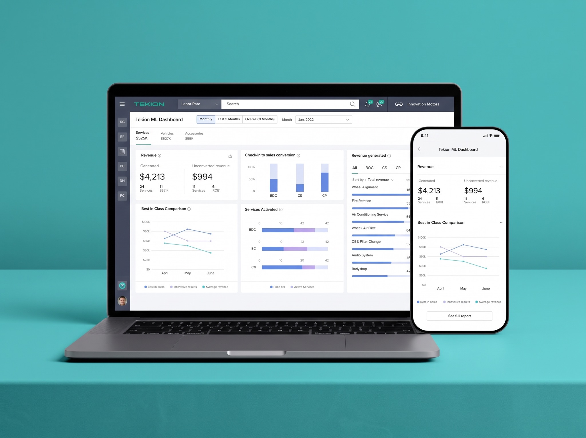
THE BRIEF
Dealership teams work with detailed information and time sensitive tasks. A major part of the challenge was designing for an older user group accustomed to straightforward, established software patterns.
The goal was not to make the product look novel. It was to make the work easier to understand and complete, using the familiarity of classic Microsoft Office style layouts as a reference.
MY APPROACH
I worked with product and engineering to understand workflow requirements, organize information and explore clearer interactions. I prioritized explicit labels, readable hierarchy and predictable controls over unfamiliar interaction patterns.
Familiarity was a design constraint, not an assumption about age. The aim was to respect existing habits while reducing unnecessary effort.
THE USER

An experienced parts professional balancing customer requests, stock information and accurate order preparation. Values familiar, straightforward software patterns.
DESIGN PRIORITIES
Build on recognizable desktop software patterns.
Use explicit labels and predictable controls.
Make the information hierarchy easy to scan.
Keep related details and actions together.
Keep relevant task context within reach.
Support efficient repetition without surprises.
INTERACTION PRINCIPLE
DESIGN DECISIONS
Group information around the task rather than treating every detail as equally prominent.
Balance discoverability with efficient repetition and predictable interactions.
Consider states, exceptions and documentation alongside the core interaction.
ACCESSIBLE INTERACTION
Use explicit labels, clear grouping and strong visual hierarchy so dense information remains easier to scan.
Support repeat tasks with keyboard shortcuts while keeping visible controls available for discovery.
Use familiar patterns and consistent actions to reduce memory load and unexpected interaction changes.
DESIGN SYSTEM CONTRIBUTION
I expanded shared Figma components and documented interaction behaviour so product and engineering teams could reuse the same logic across dense dealership workflows.
Defined reusable controls and patterns around the information and actions dealership teams used repeatedly.
Specified focus, error, disabled and completion states so behaviour remained clear beyond the main path.
Connected design intent to implementation through annotations, keyboard behaviour and engineering handoff.
Generalized state model
This generalized system view explains the contribution without exposing confidential product screens.
OUTCOME
The redesigned workflow helped dealership users reach the information and actions they needed more quickly.
Clearer structure and familiar interactions supported greater use of the redesigned experience.
Dense task information and important actions stayed together to reduce unnecessary movement through the workflow.
HOW I LED
I connected workflow decisions with product and engineering requirements, documented the interaction details and explained why familiar patterns mattered for the dealership audience. I also supported junior designers while keeping the experience consistent across the work.
LEARNINGS
Complex products do not always need less information. They need a clearer structure that helps people find what matters at the right moment.
This work reinforced the importance of balancing visual clarity with operational depth, and involving product and engineering in the decisions that shape both.